Customise the theme
Accessibility warning
While the default Volt checkout theme has been tested against web accessibility guidelines, restyling it could lead to a degraded or unusable experience for shoppers with accessibility requirements, and may result in your shopper not being able to complete the payment.
To align the embedded Volt Checkout with your website theme, you can change the colours of most of the elements in the payment container using hex colours.
When changing any of the colours, please bear in mind that our terms and conditions and QR code components must remain visible to the user. The contrast between the background and text colour should be high enough so that shoppers can see both components clearly.
paymentContainer = volt.payment({
    // ...
    theme: {
        fontColor: "#ff0000",
        linkColor: "#ff0000",
        backgroundColor: "#ff0000",
        inputTextColor: "#ff0000",
        inputBorderColor: "#ff0000",
        inputBackgroundColor: "#ff0000",
        inputBorderRadius: "#ff0000",
        payButtonTextColor: "#ff0000",
        payButtonBorderColor: "#ff0000",
        payButtonBackgroundColor: "#ff0000",
        payButtonBorderRadius: "#ff0000",
        iconColor: "#ff0000"
    }
});
Customising the theme is currently not supported on the Australian checkout.
Change the checkout height
autoHeight: boolean (default true)
The checkout component always occupies the full available width and adapts the layout to provide the best experience depending on the available space.
The height of the payment component content varies (it depends, for example, on the number of banks available in the country). By default, the payment component will adjust its height to fit the iFrame content height. This prevents the appearance of scrollbars, which is a more user-friendly solution. This feature can be disabled if required.
Usage
autoHeight: true
The height of the component will change automatically, to match the content of the iFrame.
autoHeight: false
The height of the component is restricted by the height of the wrapper. When using this setting, the heightChange event can be used to implement the size adjustment.
Find out more about Checkout events
Sample code
// Create payment component where automatic height is disabled
paymentComponent = paymentContainer.createPayment({
    autoHeight: false
});
Use your own pay button
displayPayButton: boolean (default true)
If you would like to render your own pay button outside of the embedded Volt Checkout, set this option to false to remove the button rendered inside the payment component.
The payment component emits events informing you about the current state of user input and a control method to trigger the payment activation.
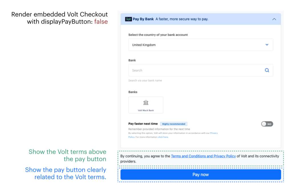
Terms and conditions location
It is a regulatory requirement for you to display the Volt payment terms and conditions above, and clearly related to, the pay button. See the sample code below for details.
Sample code
<body>
    <h1>Embedded Volt Checkout with your own Pay Now button</h1>
    <div id="volt-payment-component">
        <!-- Volt Drop-in component will be rendered here -->
    </div>
    <div id="volt-payment-terms">
        <!-- Volt payments terms -->
    </div>
    <a id="my-pay-button" class="button">Pay Now</a>
</body>// Create payment component without QR code or Pay Now button
paymentComponent = paymentContainer.createPayment({
displayPayButton: false
});
paymentComponent.mount("#volt-payment-component");
// Create the terms object
termsComponent = paymentContainer.createTerms();
// Render the terms. The target element for this should be a <div>
termsComponent.mount("#volt-payment-terms");
// Continue the checkout process when clicking the pay button
document.getElementById("my-pay-button").onclick = function() {
paymentComponent.checkout() // this will redirect the shopper to their bank
}Important
When you remove the pay button using displayPayButton: false, the Volt Checkout will also remove the QR code. Please therefore consider displaying the QR code separately.
Using your own Pay button is currently not supported on the Australian checkout.
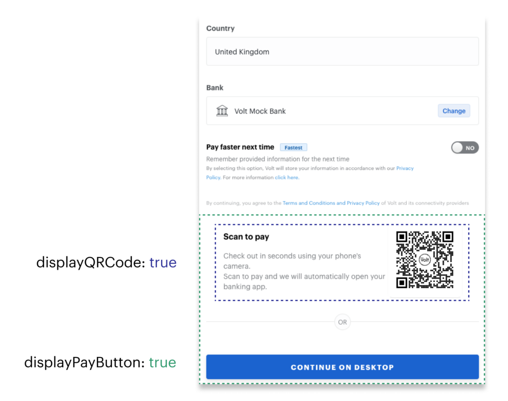
Relocate the QR code
displayQRCode: boolean (default true)
The QR code allows shoppers to easily use their mobile bank app to complete the payment. Volt will automatically hide the QR code when the checkout is displayed on a mobile device.
We suggest removing the QR code only if you either choose to display it in a more suitable place or if you use Volt Checkout in a context which makes mobile device use unreasonable.
Sample code
<body>
    <h1>Embedded Volt Checkout with separate QR code</h1>
    <div id="volt-payment-component">
        <!-- Volt Drop-in component will be rendered here -->
    </div>
    <div id="your-element-for-volt-payment-qr-code">
        <!-- QR code for switching to a mobile device will be rendered here -->
    </div>
</body>// Create payment component
paymentComponent = paymentContainer.createPayment({
displayQRCode: false // Remove the QR code
});
// Append the payment component to the respective element
paymentComponent.mount("#volt-payment-component");
// Createa a QR code
paymentQRcode = paymentContainer.createQR({
qrSize: 320 // pixel size of the QR code
});
// Inject the QR code into to your chosen element
paymentQRcode.mount("#your-element-for-volt-payment-qr-code");
<div id="your-element-for-volt-payment-qr-code">
    <!-- QR code for switching to a mobile device will be rendered here -->
    <div class="volt-qr-container" style="display: flex;">
        <div class="volt-qr-body">
            <h3 class="volt-qr-heading">Scan to pay</h3>
            <p class="volt-qr-text">Check out in seconds using your phone.<br>Scan to pay from the [bank name] app.</p>
        </div>
        <div class="volt-qr-code">
            <!-- SVG with the required size of the QR code -->
            <svg widht="320px" height="320px">...</svg>
        </div>
    </div>
</div>
Relocating the QR code is not applicable on the Australian checkout.